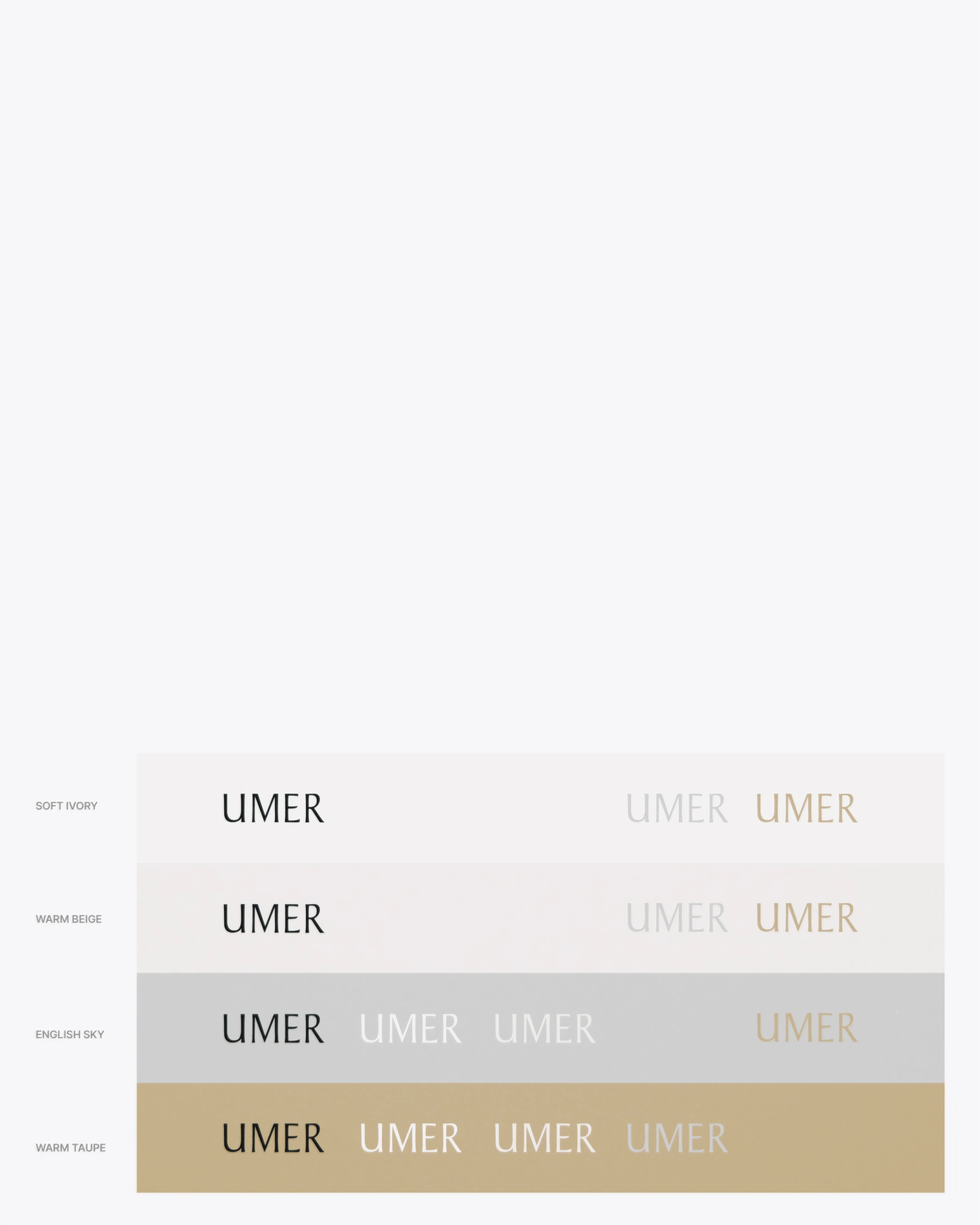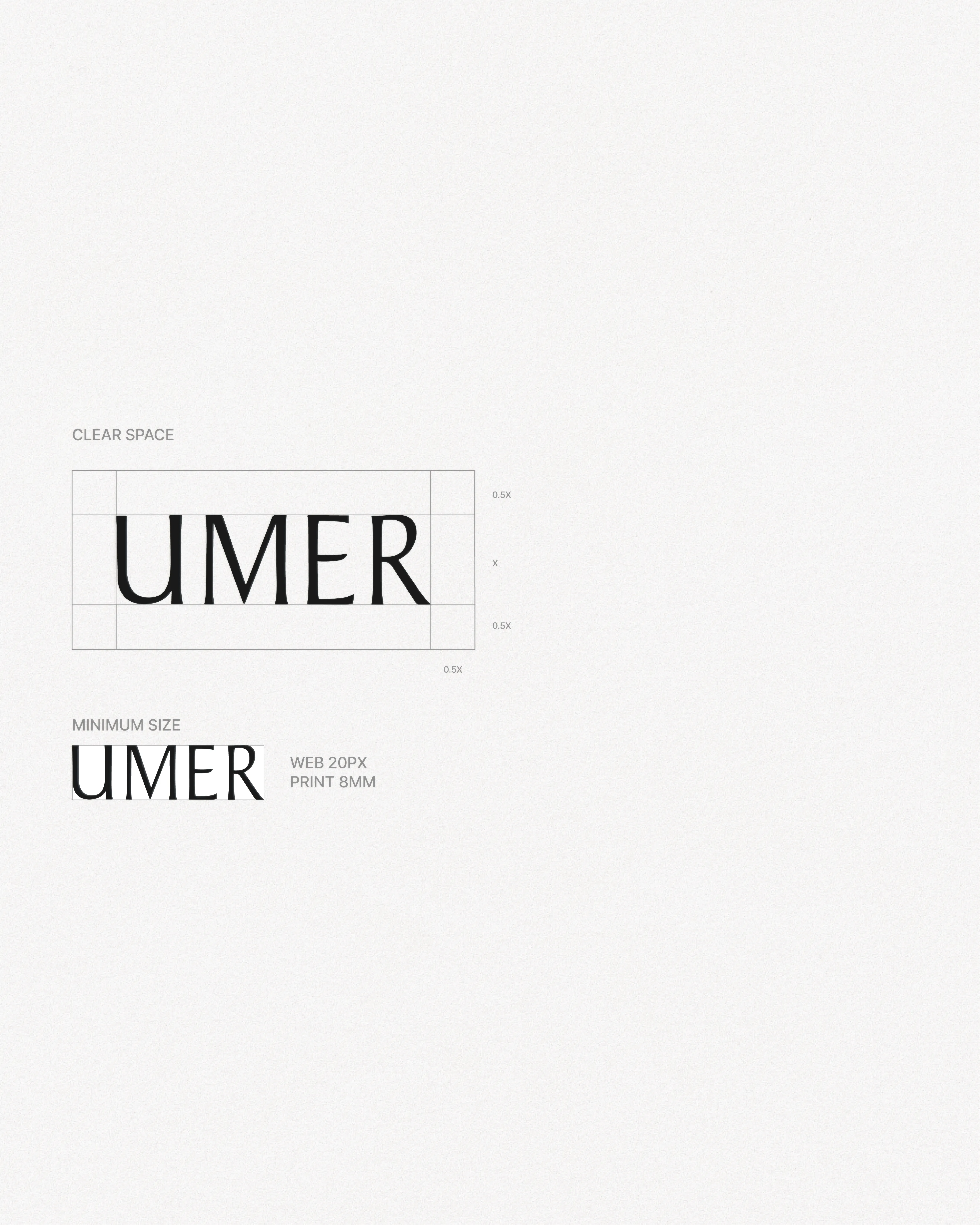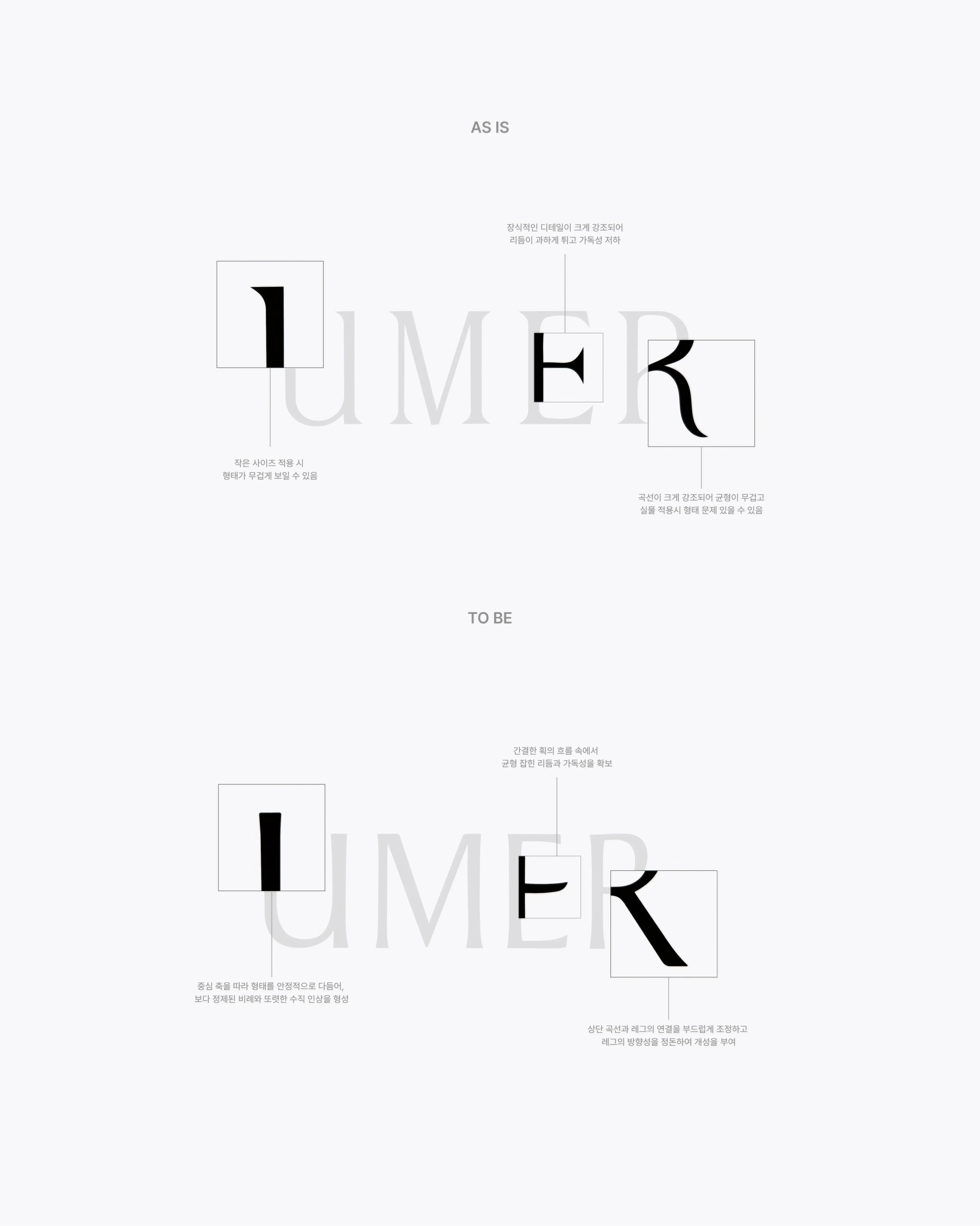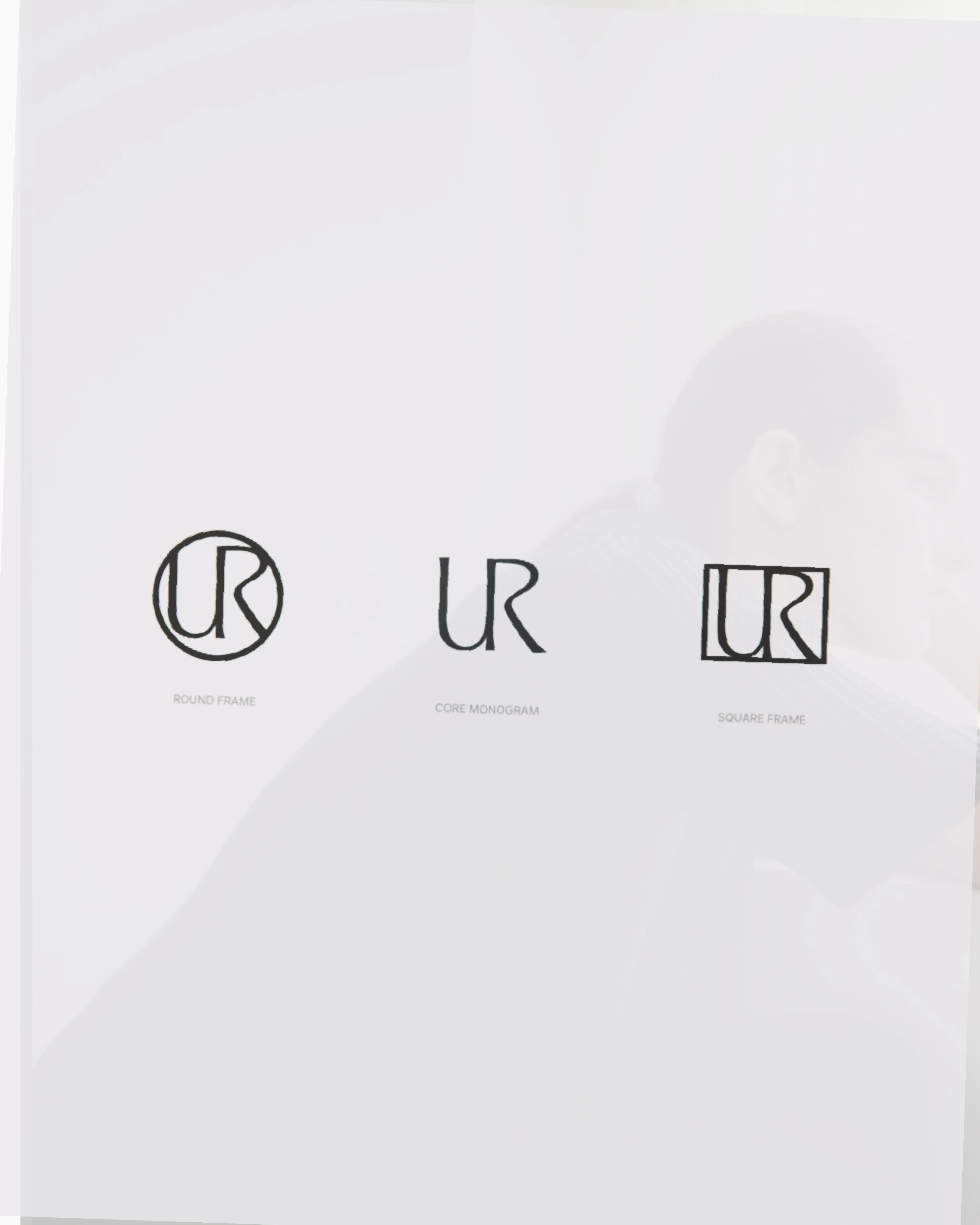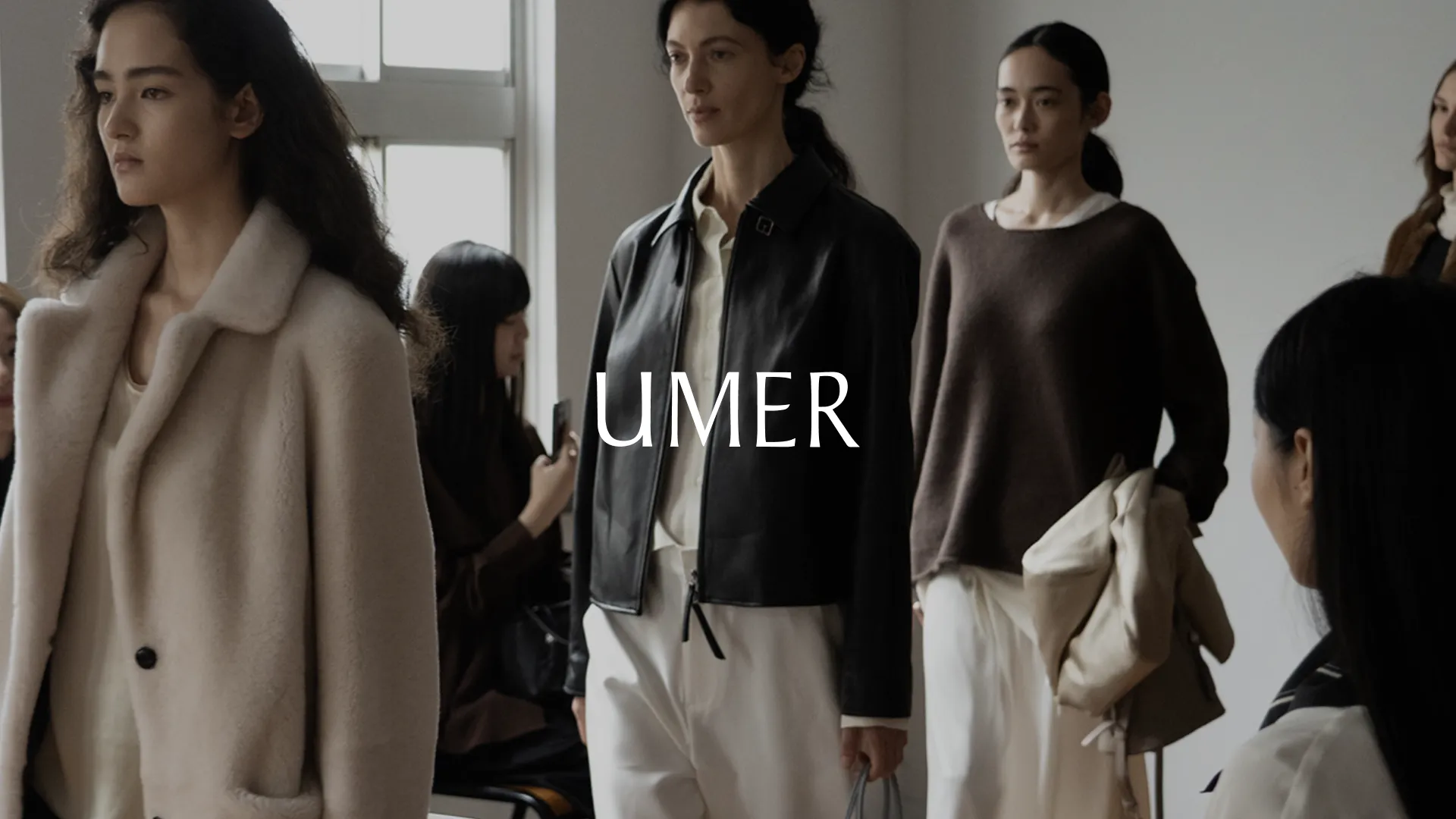
변하지 않는 가치를 제안하는 여성복 브랜드 유메르의 메인 워드마크와 심볼을 리뉴얼하고, 다양한 매체에 적용할 수 있는 그래픽 시스템을 개발하였습니다.
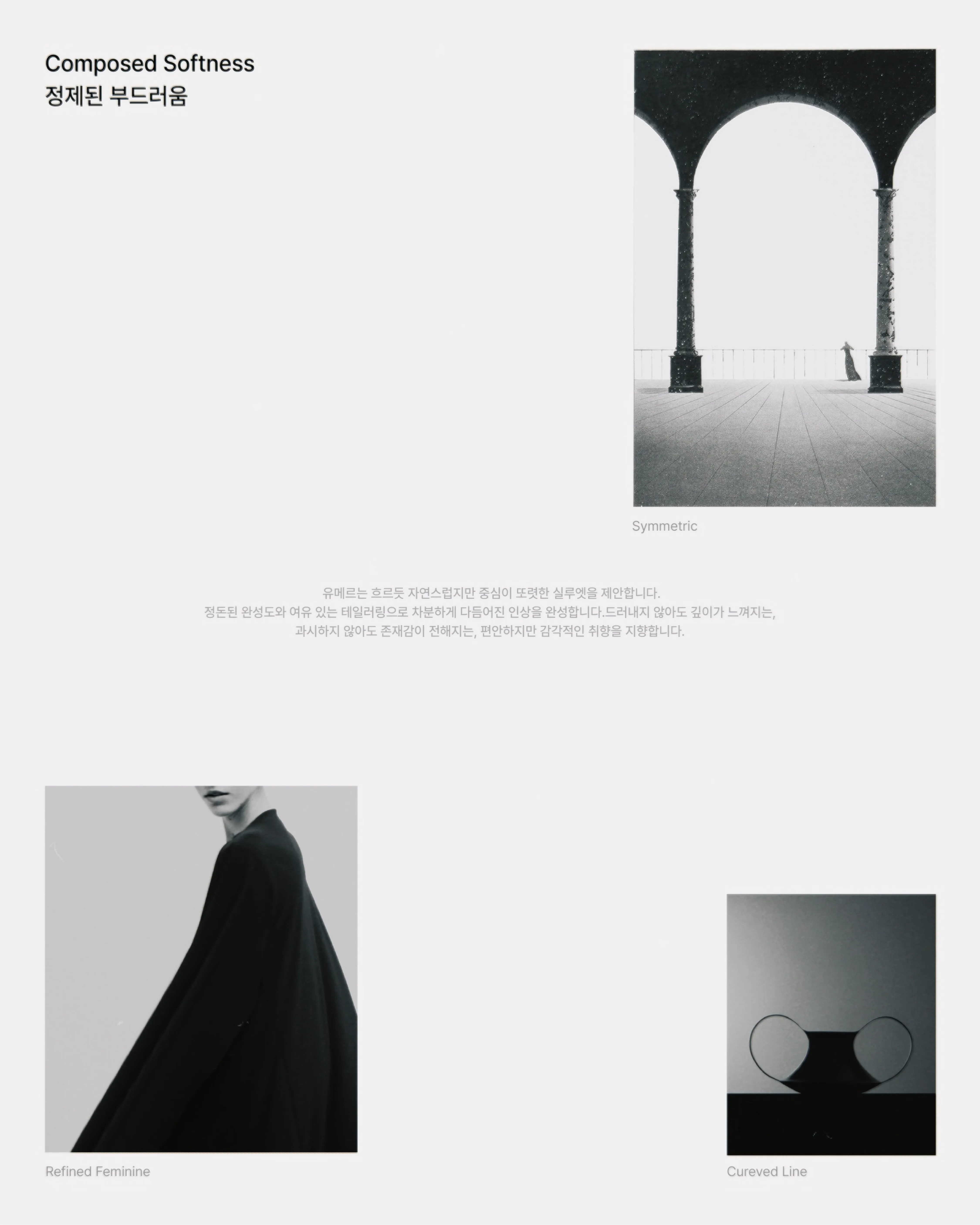
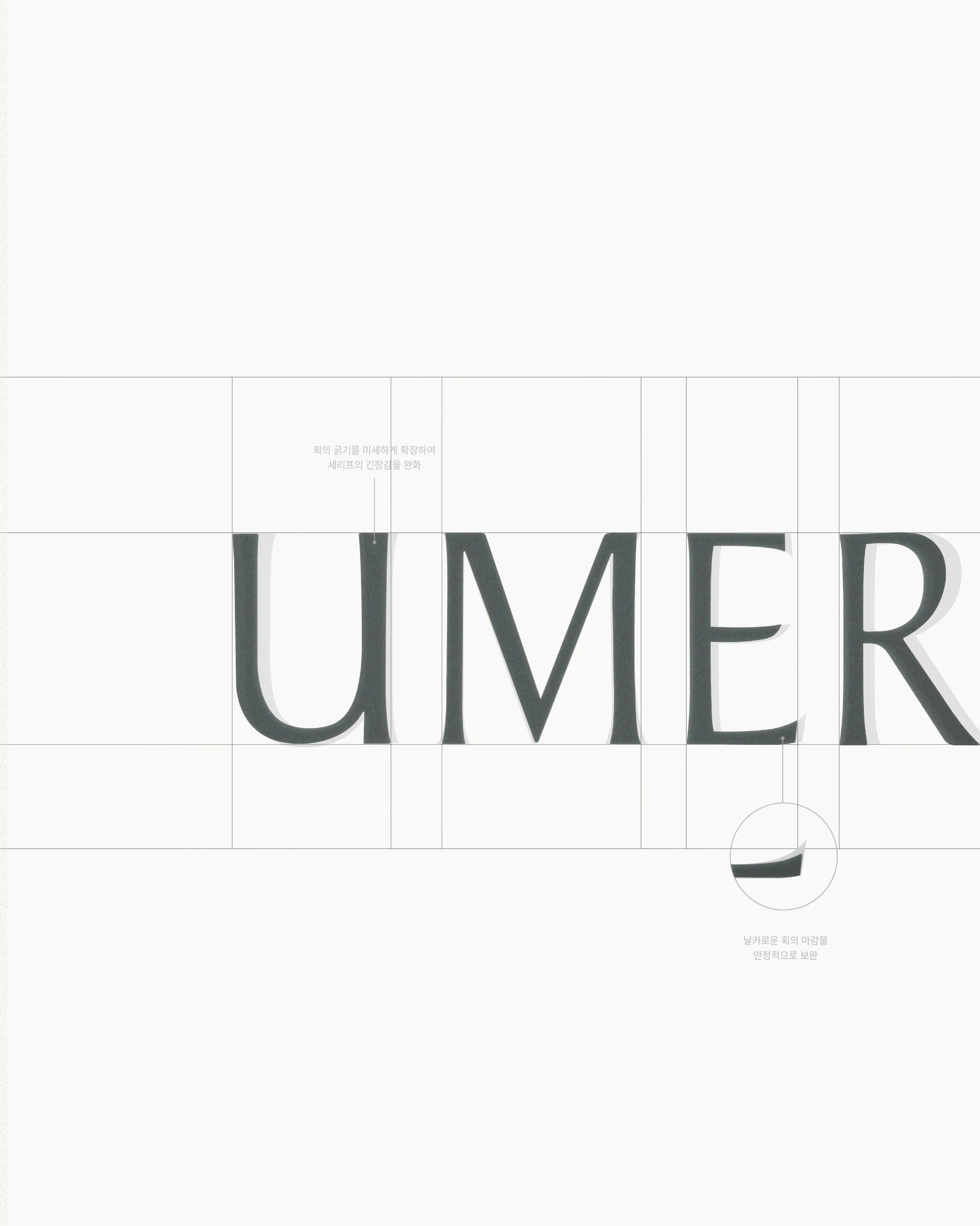
이번 리브랜딩은 브랜드가 지닌 타임리스한 가치를 유지하면서도 감각적인 이미지를 한층 선명하게 강화하는 데 초점을 맞추어, 워드마크와 심볼 모두 부드럽고 유기적인 곡선을 기반으로 설계하되, 깔끔하고 정돈된 구조로 개발하였습니다.
We renewed the main wordmark and symbol for UMER, a womenswear brand devoted to enduring value, and developed a graphic system that adapts across a wide range of media.
The rebrand focused on preserving the brand’s timeless character while bringing its sensory image into sharper focus. Both the wordmark and the symbol are built on soft, organic curves, resolved into a clean and orderly structure.